Colours play a key role in every interior design project and in everybody’s life
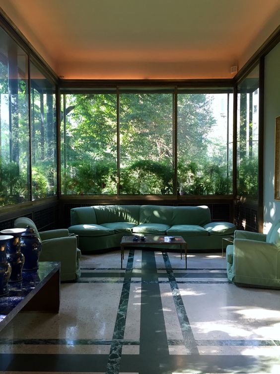
Use of green colour by Portaluppi in Villa Necchi interior design, in order to blend the interiors and the exteriors
Colours are the foundations for every project and only the best interior designers can use such powerful media in order to achieve the best interior design. But why colours are considered a great tools for interior designers?
Each individual can name at least a favourite colour and, to be honest, a black and white world would be simply too dull and monotonous.
Scientifically, colours are the first things we register when we are assessing anything, and this is why they play a key role in any best interior design project.
For this reason, when it is time to pick a colour for an interior design project it is worth relying on an interior designer.
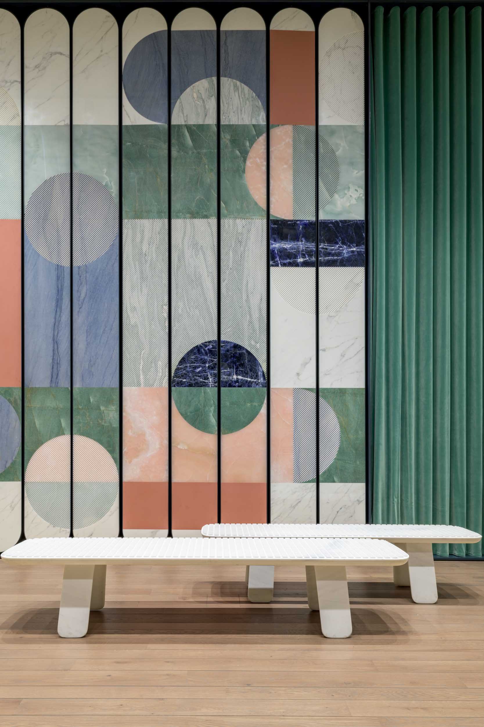
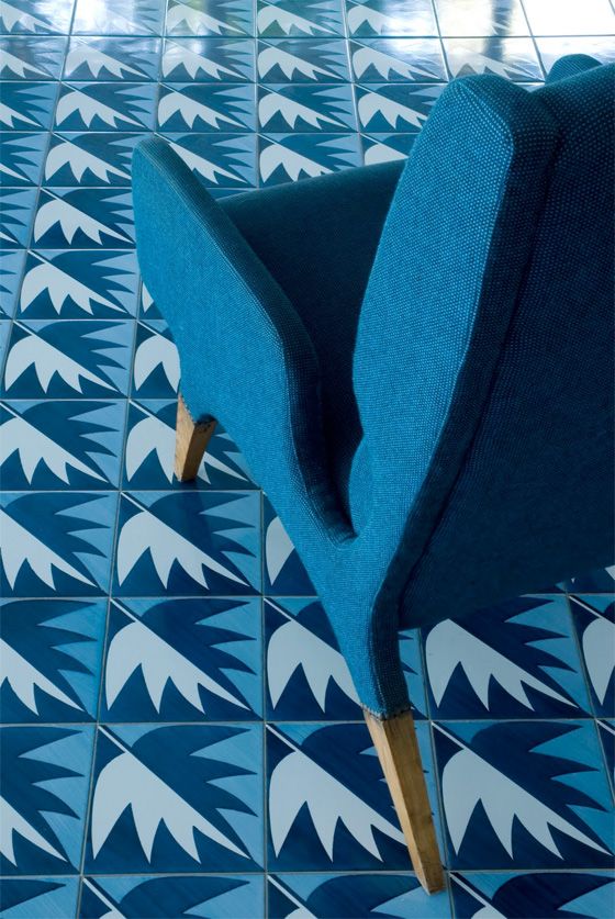
Colourful interior design composition by Patricia Urquiola at Budri showroom (Courtesy of Budri)
Should I play it safe with colours in interior design?
People tend to be careful and are worried to be too bold when it comes to decorate their interiors with colours, and most of the time this is due to the lack of confidence in using these.
Having said that , there is plenty of great examples where colour schemes in accessories, furniture, textile and patterns have been used by interior designers in a very successful way.
A recently published book on the subject of how best to sell your home goes so far as to advise against colour beige completely, showing how colours are so important also in the property market.
Nowadays a great percentage of interiors in the property development market , especially rentals, are painted beige.
It seems that this colour is interpreted as neutral; or even worst “the hope is not that everyone will like it, but that it won’t offend anyone” as said by Kassia St Clair in her book “The Secret life of Colours”.
In all of our interior design projects in London and worldwide, we have hardly used beige as the key colour of an interior design scheme.
The main reason behind this is that beige can be perceived as very anonymous colour and will potentially make your interiors look dull and boring.
One of the great example of London interior design with a strong colour palette is definitely Sketch
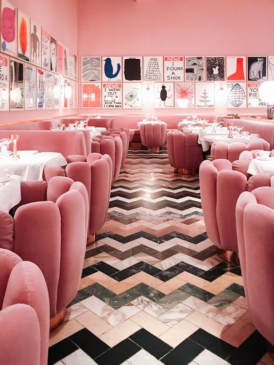
Pink design and colourful marble floor
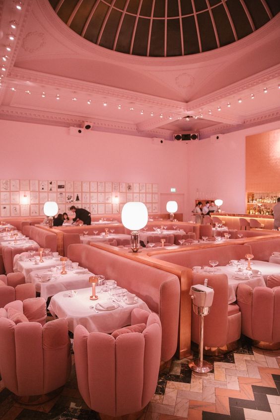
Pink Interior Design of Sketch Tea Room
Designed by French-based design guru India Mahdavi, Sketch is a great example of how colours can make your interiors unique, complimenting them and making them refined.
The Pink room, makes it almost surreal, a unique interior design space in London perfect for an afternoon tea with friends.
Pink is also one of the colours that shows how these can affect our thinking and psychology.
The colour pink is considered to be able to reduce the strength of even the toughest man.
This is the reason why in American football, there is a rule about panting the interiors of the locker rooms.
Football teams could paint their visitors’ locker rooms any colour they choose, as long as the home team’s locker rooms are painted to match.
We let you wonder why this rule had to be introduced.
The power of colour is definitely something that you appreciate in a warm and beautiful country like Italy
Italy could be considered the cradle of the Interior Design and Architecture.
In particular Milan, a city that has seen designers such as Piero Portaluppi, creator of the glamorous interior design of iconic “Villa Necchi”.
Or other designers and architects such as Gio Ponti, Luigi Caccia Dominioni, Osvaldo Borsani… and many many others.
Nowadays there is still plenty of Interior Design gems in Milan where colours play a key role
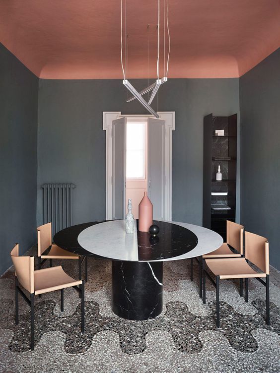
Casa Salvatori Dining Room Interiors in Milan
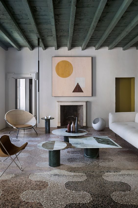
Casa Salvatori Living Room Interiors in Milan
One of these is certainly Casa Salvatori, located in the trendy location of Brera and designed by Elisa Ossino.
The apartment, situated in a palace from the 1800, retains its classical style, but with an interior landscape modernized through strong and bold colours.
The exposed beams of the main living spaces have been painted in an elegant dark green, each room in a slightly different tone.
Each piece of furniture, in contrast with the walls, sets a dialogue between warm and cool colours.
Here the colours show how they can be a key element of the interior design, changing completely the feeling of an apartment in Milan.
But if Milan interior design apartments are colourful, the use of the colours increase moving towards the interior design scene of south of Italy.
Blue colour, the key element for a luxury interior design by the sea
Amalfi coast beach villa Interior Design (© Adrian Briscoe)
Everyone, even the non-sighted, possesses a special receptor that senses the blue light. This makes the blue colour a colour that please the eyes, making them feel relaxed and at ease.
Perhaps Gio Ponti was well aware of this when designed one of the first design hotel in the world, the hotel Parco dei Principi in Sorrento, 1962. A perfect example of how to use colours in an interior
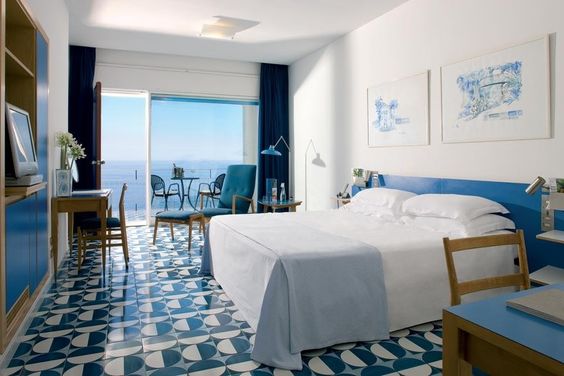
Interior Design Bedroom by Gio Ponti at Parco dei Principi in Sorrento
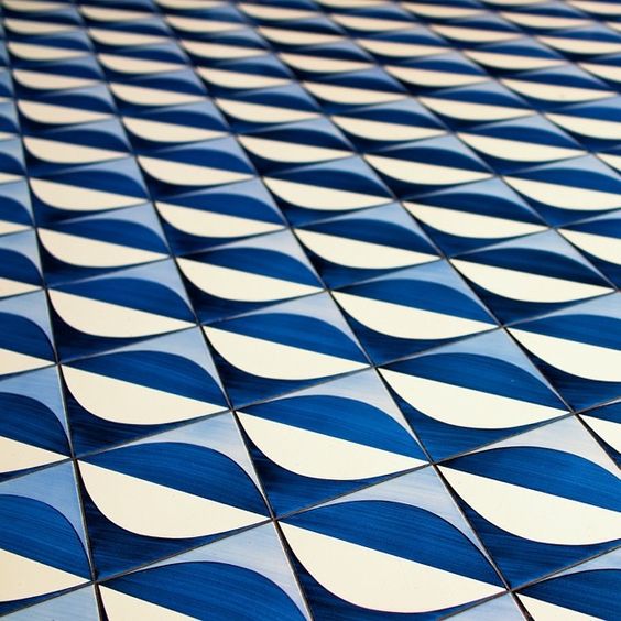
Ceramic Tiles by Gio Ponti
The interior design colours of this unique hotel in Sorrento is simply spectacular.
Based on a blue shade, the interiors colours blend in with their surroundings, merging walls, floors, and furniture with the blue sky and sea that both enter from the windows.
It is incredibly interesting to see how using the colours of the surrounding, creates such an homogeneous and astonishing interior landscape, tying the outdoor life with the interior one.
Definitely one of the best Italy’s interior design places, which inspires RotaGiorgino’s interiors significantly.
Colours Interior Designers – Ceramic Tiles and furniture by Gio Ponti
In the end we can certainly say that colours are very personal and you need to be a very brave and competent interior designer to use them.
However, these can definitely be considered as one of the best tools for the interior designers.
But, if you want to brighten up your interior design in London, Luxembourg, Milan, or anywhere else in the world, you are sure to receive from us a scheme where the colours will play a key role thanks to an informative and thorough design.
This is simply what the best interior designers do!
(All images via Pinterest unless otherwise specified)
© RotaGiorgino – Interior Designers and Architects in London – Luxembourg – Milan

